A trekker in Munich, Melbourne, or Manchester doesn't just want to read about your treks, they want to book one, often from a hotel Wi-Fi connection, a spotty airport lounge signal, or a phone on a train. If your website takes eight seconds to load a hero image, buries the itinerary PDF three clicks deep, or breaks on their phone screen, they don't wait around. They close the tab and book with a competitor who made it easy.
After years of building and rebuilding travel and trekking websites for Nepalese operators, we've identified the same three culprits behind lost bookings, and what actually fixes them.
1. Site Speed: The Silent Booking Killer
Most Nepalese trekking sites are built with beautiful, high-resolution photography, as they should be, the mountains deserve it. But unoptimized images, bloated theme files, and unnecessary third-party scripts routinely push page load times past 6-8 seconds.
Here's the problem: international travelers researching a Nepal trek are rarely on fast home broadband. They're on hotel networks in transit countries, mobile data in Kathmandu before a flight, or budget hostel Wi-Fi shared by fifty other guests. A slow site doesn't just annoy them, for every additional second of load time, the odds they abandon the page climb sharply. That's not a minor UX detail; it's a direct hit to your booking conversion rate, and it happens before a visitor ever reads a single word about your itinerary.
What actually fixes it:
- Compressing and serving images in modern formats (WebP/AVIF) instead of raw JPEGs
- Lazy-loading gallery and itinerary images below the fold
- Using a CDN so a request from Frankfurt or Sydney doesn't have to travel all the way to a server in Kathmandu
- Trimming unnecessary plugins, trackers, and render-blocking scripts that theme templates load by default.
2. Mobile Responsiveness for Foreign Networks
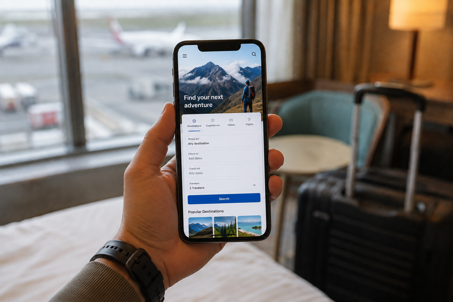
A huge share of international trekking traffic comes from mobile, travelers researching on the go, comparing operators between meetings, or browsing while already mid-trip in Southeast Asia deciding where to go next. If your booking form, itinerary tables, or PDF downloads don't reflow properly on a phone screen, you're not just providing a clunky experience, you're actively locking out the exact behavior (mobile research-to-book) that drives modern travel bookings.
It's not only about screen size, either. "Mobile responsive" for a Nepal-facing trekking site has to account for inconsistent foreign networks: fluctuating bandwidth, higher latency, and travelers switching between Wi-Fi and mobile data mid-session. A form that loses its data on a network switch, or a map widget that never finishes loading over 3G, costs you the booking just as surely as a broken layout does.
What actually fixes it:
- True responsive design tested against real network throttling, not just browser resizing
- Booking/inquiry forms that autosave input and degrade gracefully on slow connections
- Click-to-call and WhatsApp inquiry options that work instantly, since many travelers convert faster through direct chat than a long form
- Avoiding heavy embedded widgets (some booking calendars and chat plugins are notoriously bandwidth-hungry) in favor of lightweight custom integrations.
3. UX Design That Builds Trust Fast
International travelers vetting a Nepalese trekking company are managing real risk, altitude, cost, safety, logistics in a country they've likely never visited. Your website has seconds to establish credibility before they bounce to TripAdvisor reviews or a competitor. Cluttered navigation, missing permit/cost breakdowns, no visible certifications, and generic stock photography all quietly erode that trust.
Good UX for a trekking site isn't decoration, it's a trust-building funnel: clear itinerary structure, transparent pricing, real guide credentials, and a frictionless path from "interested" to "inquiry submitted."
What actually fixes it:
- Information architecture that puts itinerary, cost breakdown, and difficulty level within one scroll or one click
- Real photography and guide bios instead of generic stock imagery
- Visible trust signals, certifications, guide experience, permit handling, placed above the fold, not buried in an "About" page
- A single, clear call-to-action per page instead of competing buttons for "Book Now," "Contact," and "Download Brochure" all fighting for attention.
Proof in the Mountains: 8K Expeditions
We put these exact principles into practice with 8K Expeditions, a Mountain Tourism company led by Lakpa Sherpa and Pemba Sherpa. Rather than a template travel theme, we built a platform-first approach: optimized image delivery so the site's dramatic expedition photography loads fast even on constrained networks, a mobile-first booking and inquiry flow designed for travelers researching mid-trip, and a UX structure that surfaces itinerary, cost, and guide credentials immediately, because when your guides have real Himalayan credentials, your website should say so within the first scroll, not the fifth click.
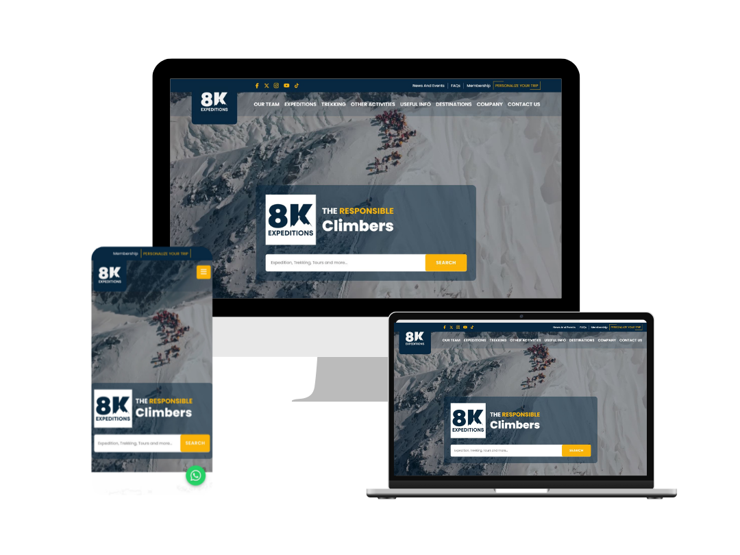
The result is a site built to convert the exact audience most Nepalese trekking operators lose: the international traveler on an imperfect network, making a fast decision about a serious trip.
The Bottom Line
Nepal's trekking industry doesn't have a demand problem, it has a delivery problem. The mountains sell themselves; the website either gets out of the way or gets in the way. Speed, mobile resilience, and trust-focused UX aren't nice-to-haves for a trekking website, they're the difference between a booking and a bounce.
At Rewa Soft, we build custom web and mobile platforms for Nepal's tourism and adventure sector, from trekking and expedition companies to mountaineering guides designed specifically for the international, mobile-first, network-constrained audience that decides whether to book with you or scroll past you.
Ready to see how your trekking website stacks up? Let's talk about what a faster, mobile-optimized, conversion-focused rebuild could look like for your business.
Team Rewa Soft